Thursday, November 20, 2008

Henri Cartier Bresson

This French Photographer was shown to me by my mom after I couldn't figure out what I should comment  about. His name is Henri Cartier Bresson. 

I find it funny that most of his work is in black and white. But, the subjects are normally ones you would see in color. When I automatically think of a black & white photo, portraits, especially ones in which you see a lot of shade and emotion on the person's face, comes to my mind. 

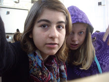
This is where he changes things up. I think that this photograph itself could be a portrait. It shows a lot about the subjects, and you can really learn about them through the small details in the background or trivial things such as their clothing. But he chooses to shoot the photo completely differently. 

I also think that he stands out as a photographer because of his work with grayscale. There is much less contrast than the other photographs I have featured in the past, but it almost seems to me that the softer colors (the grays rather than black & white) fit the people themselves. The subjects remind me themselves of peaceful people, maybe of a different culture of our own, that also seems curious. Bresson chooses to let the lack of contrast really show their personality. 

Monday, November 17, 2008

My Sweet Shadow


This photo seems to be very interesting to me. The colors are all in the same shade. They seem to be a turquoise blue and gray. It's very intriguing how the photographer seems to only use include these shades. With the emptiness of the street, it seems to make the tone of the photo seem depressing. There seems to be a large amount of contrast. Even if it is not directly black and white. There is a lot of dark and bright colors.

When I also see this picture, I think of a rainy or cloudy day. There is small detail on the ground. There is a bright white gloss that looks like drops of water.

I think what stands out is the figure next to the street lamp. So much could be built off of that. It gives the viewer freedom to imagine (using the mood and other elements) to create a background story or a detailed description on what is going on.

The title is also very peculiar, and I wonder what the photographer meant when titling the piece.

Sunday, November 16, 2008

Nuclear Protest


I found this image on Time Magazines' Photos of the Week, and instantly found it entrancing. The colors are almost conflicting. There is a bright and soft spring color in the field in which the hooded figures stand. The subjects and the nuclear field are dark and solid, giving it a depressing mood to it, as well as those colors reminding me of industrialization. The one holding a flower is conflicting the colors, almost like a contrast.

I also find it a powerful picture. The figures look like they are in search of a kind of peace or break from industrialization. What is also interesting is the light coming from the suggested power plant. It almost looks like a hope is shining through the industrial nuclear plant.

The way that the subjects are positioned on the side of the photograph makes it interesting as well, because you see a lot more of the yellow flowers stretching all the way out ot the solid gray light. It seems to me that it represents something, yet I do not know what.

Wednesday, November 12, 2008

Woman & Sphinx

http://i216.photobucket.com/albums/cc156/lotus_feet/NinavonSchlebruggandSphinxEgyptPark.jpg
This photograph is oddly very interesting. I just think both of the subjects, (the woman and the sphinx conveniently behind her) are completely unrelated. Judging by her hat and the small amount of clothing that I can see, it looks like she is European or American, whereas the sphinx, as you may already know is traditional Egyptian work.

The thing that makes this picture well captured is how the woman seems to be entirely captivated by the sphinx, or feels a certain connection. Her hand on the sphinx's head crown enhances the emotion.

What I also find interesting is the difference in contrast between the two subjects. The woman herself has a large amount of contrast, from her pale white skin to her black hat and eyelashes. However, the sphinx itself seems to reside in the many shades of gray, even with the incredibly light part at the bottom.

I looked carefully in the background, and what I see is some sort of a hut, to the central right, and located at the top left is some sort of a thing (I think it may be a tree) with many shades of gray. It really makes me wonder where this was taken. There are so many different places it could have been. Maybe in Egypt, where the sphinx belongs, or even in some Hollywood studio.

Sunday, November 9, 2008

http://i.timeinc.net/time/potw/20080508/potw_04.jpg

This photo was featured by Time as one of their photos of the week. It definitely is an interesting concept. I don't know where this photo was taken, but it seems to me that all the men in the statue were fighting for freedom or a cause, which resulted in a monument honoring their efforts. The woman can now walk in the street like this because of them.

What I find striking about this photo is the subject's position. She is not in the center, but rather near the bottom right. I find it a very interesting placement because it is literally close enough to the center bottom. Another striking thing to me is the bright red of her coat compared to the grayscale of everything else.

Saturday, November 8, 2008

Sophie JARRY

The thing I really like about black and white photography is the details. It seems to me that in color, you miss out on certain details because they seem to be washed out because of all the other colors. Black and white is so simple that you get a lot more contrast, and certain human details seem to stand out.

The photographer is one of my favorites, Sophie Jarry, who specializes in musical photography and portraits. What I really like about her vision is that she wants to capture her subject doing something completely in character. Even though the subject is more than aware he's being taken, he doesn't pose and smile, instead he does what would come naturally to him.

I think what is also very interesting is the amount of contrast she uses in her photographs. It is recurring throughout many of her shots. She seems to use a lot more blacks and whites rather than everything in between. I find it to be a very interesting coloring she uses.

Most of her photos can be found here:

http://sophiejarryonstageandback.neufblog.com


Here are some other photos from her:


Monday, November 3, 2008

Steve SCHOFIELD & Background

I think that the background of a photo is something that I tend to focus on a lot when faced with a photograph. I like photos that either have a complex subject and a simple background and vice versa.

Here's a photo I admire due to the background usage.

As you can see, the subject is obviously the Storm Trooper. What I find really strengthens the picture is the simplicity of the background. The funny thing is that there is a lot of detail in the background, yet it stays simple with the basic color contrasts. It's also a background that is an urban area. Because of the background, it brings up a lot of questions for the viewer. Questions such as, "What is this Storm Trooper doing in such an area?"

The great thing about this photo is just how comfortably the subject fits in the photo. Although it is not at all normal to find a Storm Trooper in an airport-esque building, it seems to really fit, with the colors that the background and subject have.


This photo is also an interesting one regarding everything going on outside of the subjects. The foreground, as well as the background can always tell you some obvious things about the photo. For example the setting. In this photo, your attention could be directed to the poster by the girl's head, describing Oklahoma's Semi Centennial Celebration.

I also like the background in this photo. The tree and street lights give it a nice little setting. It helps remind me of the childish games we would play with the other kids in our neighborhood. Of course, it may be apparent that the children are playing, however, the background of a road with street lights in the background seems to help me understand the "story" behind it.

Sunday, November 2, 2008

What Lies Beneath i & ii - Carla DIOT


Since my last two posts were portraits, I decided to stray a little differently. I couldn't find a decent photo to use, but, I remembered the series I took in August 2007. It was with a disposable underwater camera. For those who don't understand, I can tell you that this photo was taken underwater, looking up, and I can also tell you that this photo was painstakingly difficult to take. 

When I took this, I remember that my idea was about perspective. I've always liked being underwater, and thought that everything looked interesting underwater. So I thought about an popular question: What if you were the reflection in the mirror? However, instead, I applied it to what you see when you look into clear blue waters. One of my favorite things about this photo other than the concept is the different color usage in the photo. For example, there is the blue sky, the blue of the pool wall, and my personal favorite, the red and white of the lifeguard's chair. I just find that in the combination of the blue sky and the red and white of the umbrella, it just works really well to create a contrast on the surface.

The other photo in the series:


The concept of this photo was sort of: standing on water, or just the perspective of looking down on the sky, rather than the normal direation of up.

Saturday, November 1, 2008

Robert DOISNEAU - Les Enfants de la Place Hébert (The Children of Hébert Place)


I find that I really do like photography that involve people.

But I find that this portrait stands out to me for a few reasons.

I think that it is interesting, because the subjects are aware of the photographer, yet there is such liveliness and personality in the portrait. Not that it usually lacks in most portraits. I just think that the photographer has done a great job in giving them soul. Whereas many portraits involve children looking straight at the camera, face fully showing, this photograph has variety among the subjects. The youngest subject has a look of curiosity and shock--like she has never seen a camera before, and is in wonder of what is going on. The one above her is much more casual, yet surprising the photographer with her humorous expression. The final subject has almost the impression that he's unaware of the photographer, or he's just trying to look cool. I think it's really great that the viewer can see who the subjects actually are as people such as ourselves. 

I find it very interesting that the background seems to be entirely empty of minor "subjects" despite its location in Paris. 

Thursday, October 30, 2008

Frank SINATRA, Monte Carlo - Herman LEONARD


Let me start off this blog with a brief introduction of Herman Leonard, our photographer of the day. Herman Leonard was a renowned American jazz photographer who was born in 1923.

Here is also a little spiel about the subject. Frank Sinatra was a famous jazz singer who lived from 1915-1998. He is also known for his “rat pack” a group of entertainers that were known in the fifties and sixties.

I think that’s enough context for the image itself.

I really find this piece to be absolutely remarkable. Not only does this piece have great contrast, it stands out to me as something that defined his era. You can see the microphone shining in front of his chest, and the cigarette smoking loosely from his hand. There seems to be a lot of spirit in the way he is posed as well, that shows us, the viewer, his passion for the jazz industry.

I find that the lighting thrust upon him on the edges of his silhouette (though maybe accidental) is also a great addition to this photo. The lighting gives him an air of divinity, as if he is playing the role of a jazz god.

Finally, the thing I really do like about the photo is just the size of his silhouette compared to the background. He is centered, and a fair amount of him is seen, so that a lot of room is left for the background, which to me, just oddly works.